Research and Comparison
Analyzing EcoMarket against other e-commerce platforms
Introduction
This research compares EcoMarket with Daraz, Nepal's leading e-commerce platform. The comparison focuses on design elements, features, and user experience to understand how EcoMarket can provide value to customers interested in sustainable products.
Websites Compared
- Daraz: Nepal's largest online marketplace offering a wide variety of products including electronics, fashion, home goods, and groceries with local and international brands.
- EcoMarket: A specialized platform dedicated to sustainable and eco-friendly products.
Comparison Table
| Feature | EcoMarket | Daraz |
|---|---|---|
| Design Style | Simple, clean design with a theme of green color underlining sustainability. | Banners, flash sales, promotional interfaces. |
| Navigation | Simple menu with well-defined page links and clear navigation | Several categories, mega menus, search bar, and quick access to deals. |
| Product Display | Flex layout, which also has cards with the image, description and pricing of specific products. | In dense grid format with discount badge, rating, and original/sale price. |
| Color Scheme | Green and white with reflecting color of green and white that implies eco-friendly theme | Orange and white with bright promotional colors. |
| Product Filtering | Basic category filtering using JavaScript | Advanced configuration such as price range, brand, location, rating and deliveries. |
| Product Information | Product cards that provide the option of direct purchase and the main features of the product sold | Full specifications, customer reviews, sellers rating, and delivery. |
| Purchase Attributes | Virtualized Add to Cart and Buy Now buttons with console messages | Full shopping cart, first party payments (COD, online banking, mobile wallets) and shipping tracking |
| Educational Content | Thorough blog about sustainability education and tips | Minimal educational content, mostly about promotions and shopping guides. |
| Technology Used | Basic interface in the form of HTML5, CSS3, and plain JavaScript with dynamic interactions | Advanced shopping platform with support services like the integration of the backend systems and databases, as well as payment gateways. |
Visual Comparison
Below are side-by-side screenshots comparing the design and layout of Daraz and EcoMarket across different pages:
Home Page Comparison
|
EcoMarket Home Page: 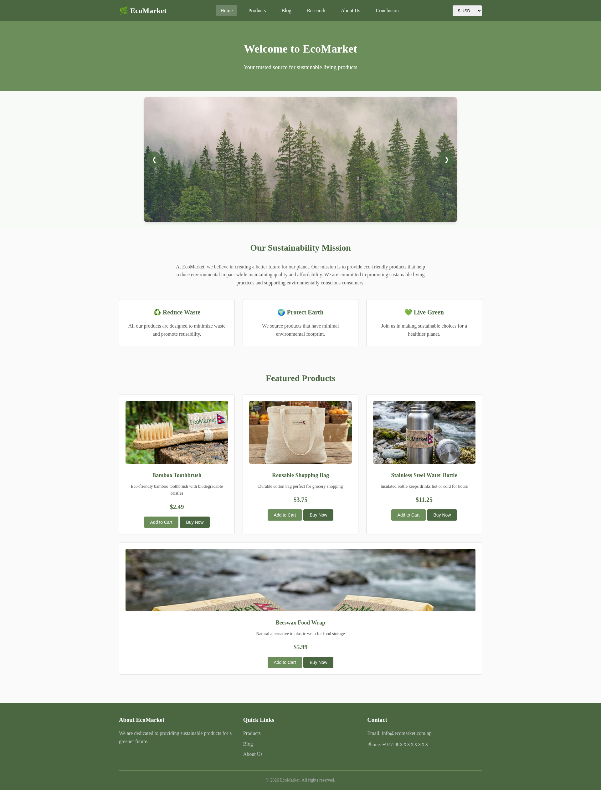
|
Daraz Home Page: 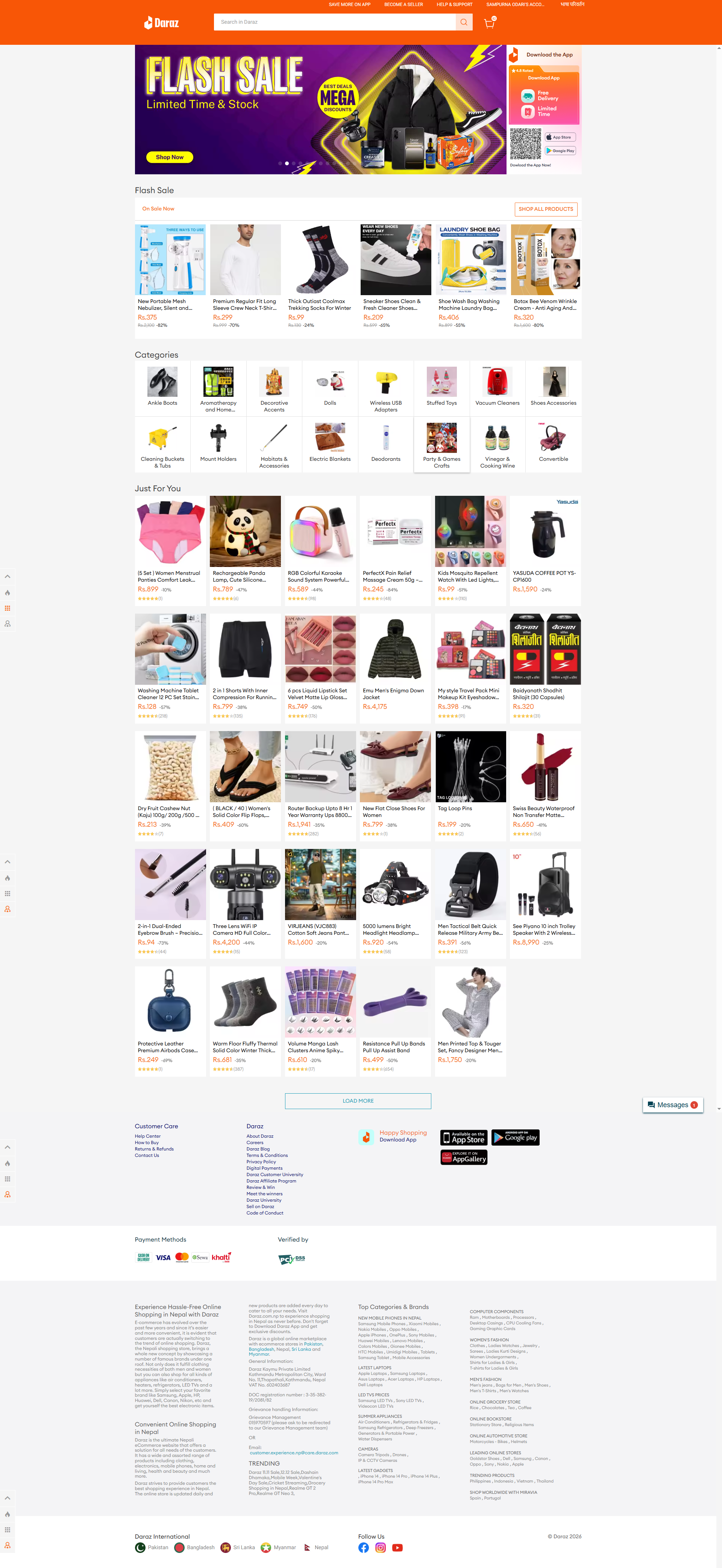
|
Detailed Home Page Analysis
| UI Component | EcoMarket | Daraz |
|---|---|---|
| 1. Header & Navigation |
Minimalist & Navigational • Focus: Exploration over search. • Structure: Traditional text links (Home, Products, Blog). No search bar. • Vibe: Clean, brochure-style navigation. |
Utility & Search-Centric • Focus: Efficiency and finding specific items. • Structure: Prominent central Search Bar + Cart icon. • Vibe: High-density utility (login, app links) packed into the top bar. |
| 2. Hero Section |
Emotional & Mission-Driven • Visuals: Solid green block with centered text; sells a "mission" rather than a product. • Typography: Serif fonts (conveys trust/tradition). • Goal: Establish brand identity and values first. • Image Slider: Simple auto-rotating image slider showcasing eco-friendly products with manual navigation buttons. |
Promotional & Action-Driven • Visuals: Dynamic "Flash Sale" banners with bright colors (Purple/Yellow). • Typography: Bold Sans-Serif (conveys urgency/modernity). • Goal: Immediate conversion ("Buy Now"). |
| 3. Body & Layout |
Spacious & Curated • Whitespace: Heavy usage creates a premium, calm feel. • Density: Low. Focuses on a few key items with clear images and buttons. • Grid: Uniform, consistent card-based layout. |
Dense & Algorithmic • Whitespace: Minimal to maximize screen real estate. • Density: High. Packed with ratings, discounts, and shipping info for comparison. • Grid: Variable (small category icons vs. infinite product grids). |
| 4. Footer |
Simple & Informational • Content: Essential columns only (About, Links, Contact). • Design: Solid dark color block for contrast. • Purpose: Basic navigation and brand reinforcement. |
Complex & Trust/SEO Heavy • Content: Massive lists, payment logos, QR codes, international links. • Design: Text-heavy lists on a white background. • Purpose: Build trust (security badges) and boost SEO rankings. |
Products Page Comparison
|
EcoMarket Products Page: 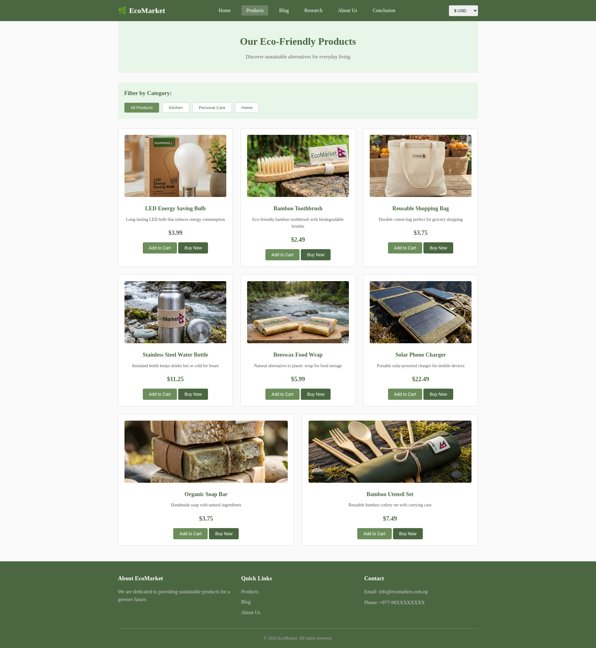
|
Daraz Products Page: 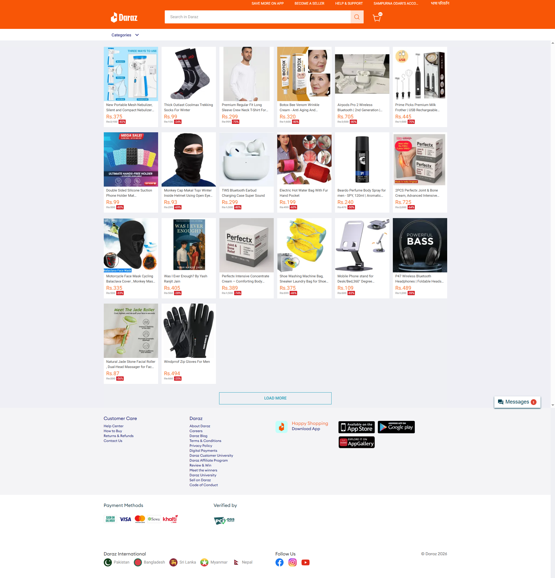
|
Detailed Products Page Analysis
| UI Component | EcoMarket | Daraz |
|---|---|---|
| 1. Header & Navigation |
Consistent & Curated • Structure: Identical, minimalist header from homepage. • Context: Uses a dedicated hero section ("Our Eco-Friendly Products") to clearly set the page context. |
Search & Utility • Structure: Persistent orange header focused on the Search Bar. • Context: Relies on breadcrumbs/dropdowns rather than a clear page title, indicating deep hierarchy. |
| 2. Filtering & Layout |
Guided Selection • Filtering: Prominent, large buttons (All Products, Kitchen, Personal Care, Home) encourage niche exploration. • Grid: Spacious card-based grid gives each product significant screen real estate. |
Volume & Variety • Filtering: Minimalist dropdown menu; less prominent to prioritize inventory display. • Grid: Dense 6-column grid maximizes items above the fold for rapid scanning. |
| 3. Product Card Visuals |
Clean & Informational • Visuals: Large, clean images; no badges or overlays. • Content: Includes short descriptions to explain product value. |
Noisy & Price-Driven • Visuals: Small images with overlays ("MEGA SALE") and "noise." • Content: No descriptions; focuses on truncated titles and metrics. |
| 4. Call to Action (CTA) |
Direct & Low Friction • Buttons: Two visible buttons per card ("Add to Cart", "Buy Now") allow immediate purchase without leaving the page. |
Indirect & Engagement-Focused • Buttons: No visible buttons on the card. Users must click the image to view details (increases click-through rate). |
| 5. Pricing Strategy |
Transparent & Stable • Display: Simple price (e.g., "$3.99"). No discounts or strike-throughs visible, implying fair, stable pricing. |
Psychological & Urgent • Display: Heavy use of color (Orange/Red), strikethrough prices, and discount badges (e.g., "-40%") to trigger FOMO. |
| 6. Footer & Pagination |
Finite Catalog • Mechanism: No visible pagination; suggests a manageable, curated list. • Footer: Simple 3-column layout. |
Infinite Scroll • Mechanism: "LOAD MORE" button encourages endless browsing. • Footer: Massive section with trust signals (Visa/Mastercard) and app links. |
About Page Comparison
|
EcoMarket About Page: 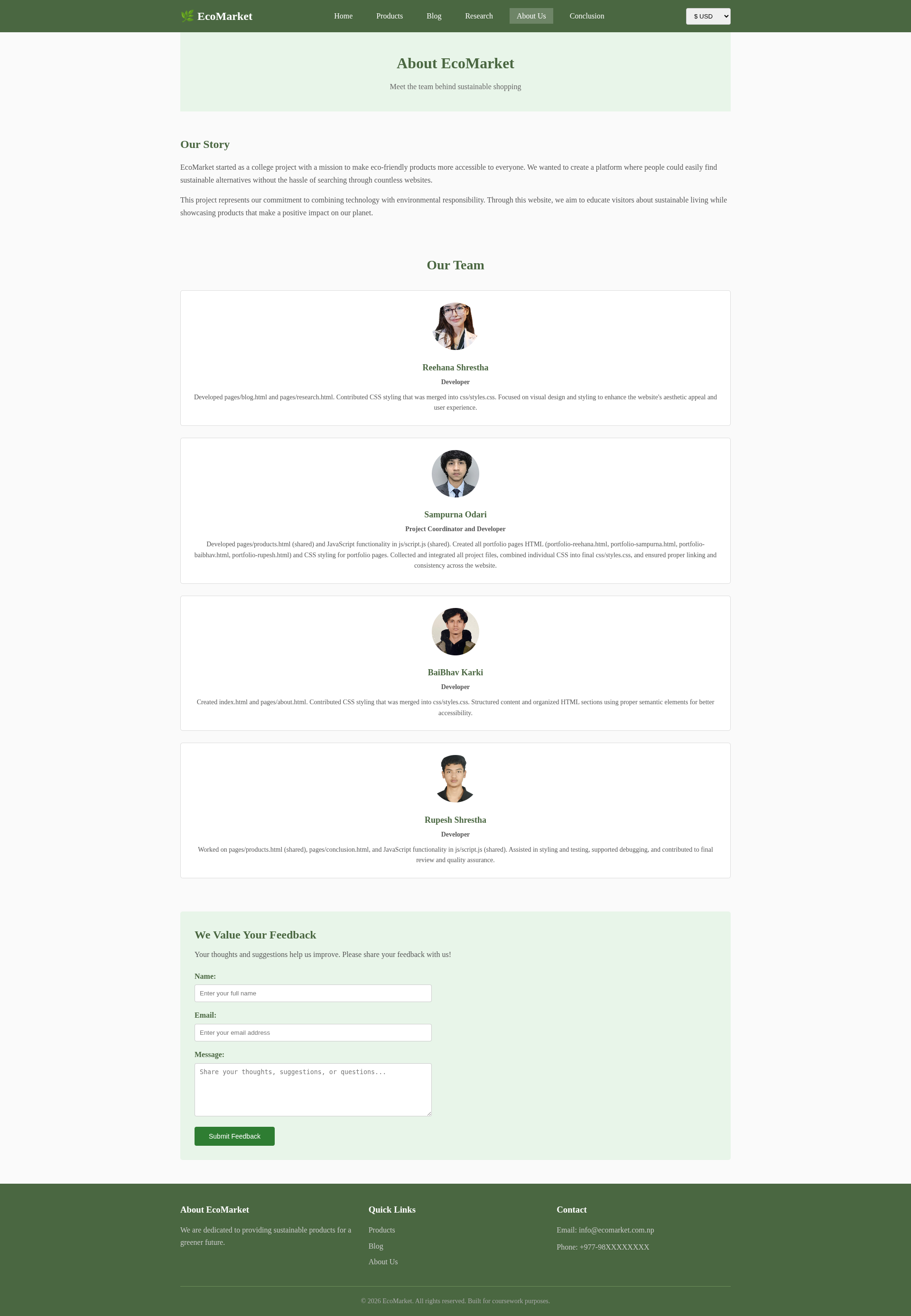
|
Daraz About Page: 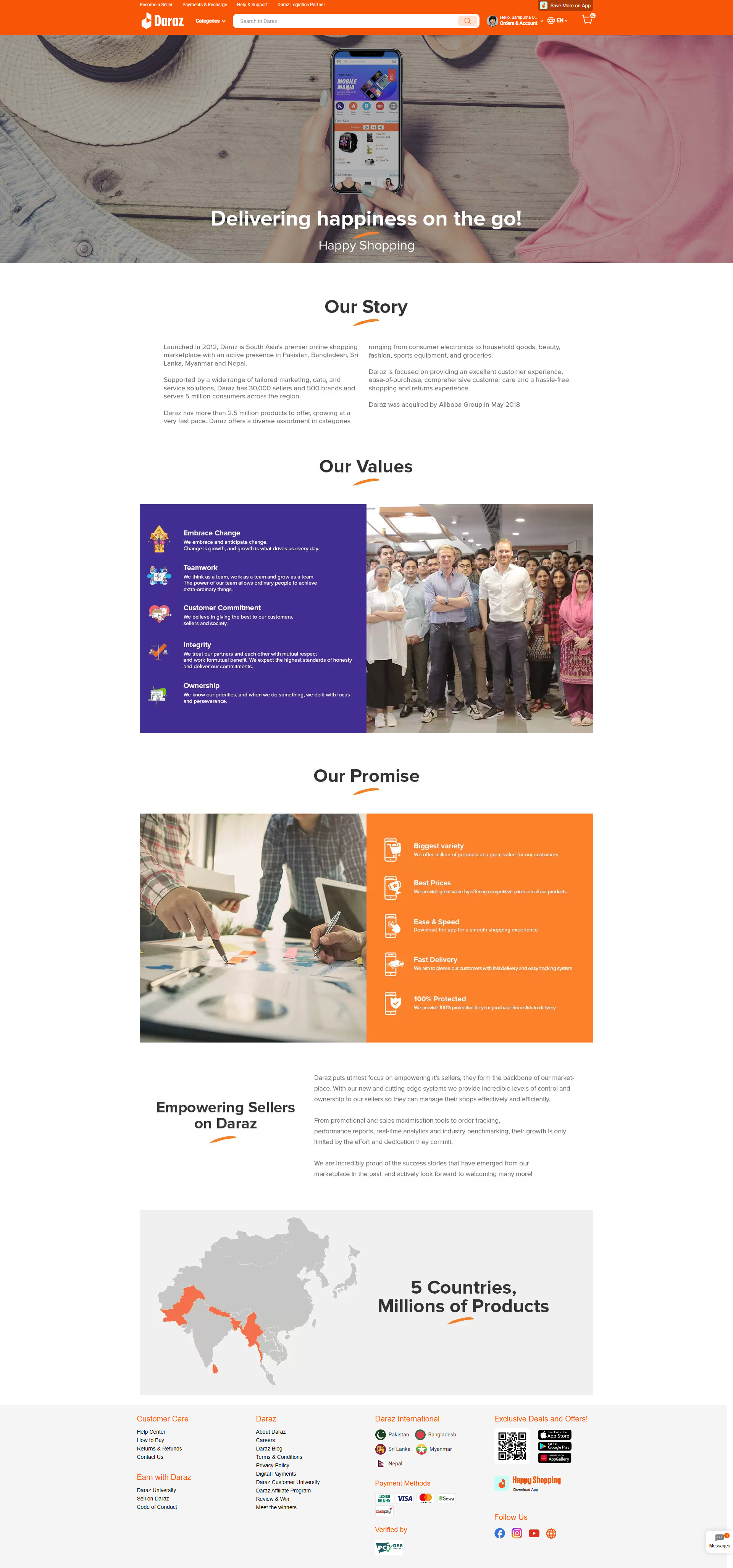
|
Detailed About Page Analysis
| UI Component | EcoMarket | Daraz |
|---|---|---|
| 1. Structure & Narrative |
Personal & Origin-Focused • Hero: Simple text header "About EcoMarket" with a subtitle explaining it is a "college project." • Flow: Origin Story → The Team → Feedback Form. • Vibe: Transparent, humble, and human-centric. |
Corporate & Mission-Focused • Hero: Lifestyle imagery ("Delivering happiness") rather than just a title. • Flow: Our Story → Our Values → Our Promise → Regional Map. • Vibe: Expansive, professional, and brand-centric. |
| 2. Human Element (Team) |
Individual Recognition • Display: Features specific cards for 4 team members (e.g., Sampurna Odari, Reehana Shrestha). • Detail: Lists specific technical contributions (e.g., "Developed pages/blog.html," "CSS styling"). • Goal: To credit the creators and show the faces behind the code. |
Collective Identity • Display: Uses a large group photo of employees to represent "The Team" rather than individuals. • Detail: Focuses on abstract values (Teamwork, Integrity) rather than individual roles. • Goal: To show scale, culture, and corporate unity. |
| 3. Content Strategy |
Transparency & Feedback • Unique Feature: Includes a functional "We Value Your Feedback" form directly on the page. • Message: "We are learning/improving." It invites direct communication from the user. |
Scale & Trust • Unique Feature: A map showing "5 Countries, Millions of Products." • Message: "We are established/reliable." It uses statistics and geographical reach to build consumer confidence. |
| 4. Visual Hierarchy |
Card-Based & Text-Heavy • Layout: Uses a clean grid of cards for the team members. The text is readable and educational, explaining how the site was built. • Icons: Minimal/None. Relies on profile photos. |
Iconographic & Graphical • Layout: Uses distinct sections with icons (e.g., handshake for "Customer Commitment") and infographics (Map). • Icons: Heavy use of iconography to make corporate values skimmable. |
| 5. Footer |
Consistent Navigation • Design: Keeps the standard 3-column footer found on other pages. • Purpose: Maintains simple navigation to Home/Products. |
Trust Anchors • Design: Massive footer with payment logos and app store badges. • Purpose: Reinforces that this is a secure, transnational platform. |
Design Difference
Daraz
The design of Daraz is vibrant and heavy on advertisement and is focused on achieving its goal of acquiring sales through flash deals and offering many kinds of discounts. The interface is full of vibrant and attractive shades and is heavily loaded with various banners and discount badges. The interface is well designed with attractive orange and white colors with vibrant shades of brightness to deliver an engaging shopping experience based on deals and offers. Despite its wide array of features, its design is heavily loaded with several advertisement features.
EcoMarket
EcoMarket has a simple "no frills," "no clutter" kind of interface, and emphasis has been given to simplicity as well as comfort in the interface of the website. The color scheme of green and white immediately sends a message about the environmental focus of the website to the users' eyes. The simple interface has been created to ensure that the users are not distracted by the actual form of the website design and can view information by looking at the actual structure of the website in a simple manner. This strategy can be seen as perfectly applicable to a coursework project to a certain extent.
Unlike the "deals-focused" strategy in the case of Daraz, a lot of emphasis at EcoMarket is given to the quality of the product as well as its environmental benefits.
Feature Differences
Filtering and Search
While Daraz has a better filter system with options like price, brands, location of the seller, ratings, etc. Another strength of this platform is its robust search engine. EcoMarket is using a simpler category-based filtering system with simple JavaScript. This is enough for the course work and is sufficient given the number of products.
Product Information
On both sites, client information on products exists; however, this information varies in content between the sites. On Daraz, client reviews with ratings and shipping schedules are emphasized. On the website, special attention to prices and percentage sales is drawn. It was in this respect that EcoMarket exhibited the information on the pages of product cards. There was an emphasis on one of the characteristics of a product being sustainable to the environment and the ability to purchase it immediately. There was more emphasis on the quality of the product and that it was environmental-friendly.
Educational Content
As compared to Daraz, which focuses on transactions and has mainly promotional content, EcoMarket has a lot of informative content on a specific topic, i.e., sustainability, technology, and environmental influences. Therefore, EcoMarket not only becomes a market but also a learning guide on how to live sustainably. The basic content strategy on which Daraz works is based on shopping content/guides, promotion, and seller spotlight.
Technology Complexity
Daraz uses sophisticated backend services, database management, payment gateways, and sophisticated frameworks that help handle numerous products, sellers, and even transactional events in real-time. EcoMarket has adopted a minimalist approach based on the use of coding languages like HTML, CSS, and JavaScript in their implementation. It has applied this code to some level of minimization in terms of understandability, maintainability, and even explanation in terms of coursework.
Such improvements have already been implemented in EcoMarket.
1. Focused Mission
EcoMarket has its mission clearly and strongly aligned on sustainability compared to the general marketplace. All the products and content can be judged to be conducive to the environmental values and can be termed an integrated brand.
2. Educational Approach
EcoMarket not only sells but also educates their site visitors about the need to be sustainable, how being sustainable is influenced by technologies, and how they need to be environmentally friendly. The good blogging content is also important to their non-buying site visitors too.
3. Simplicity and Clarity
EcoMarket offers simple usability through its lack of unneeded complexity. Secondly, it offers low cognitive load through its simple navigation and design and thus can be used with ease irrespective of who the user is.
4. Interactive Buy Capabilities.
EcoMarket also allows for virtual e-commerce habits such as the clickable "Add to Cart" and "Buy Now" words for any product in the list. Although they do not make actual purchases because they are on a static website for a course, they prove that you are familiar with the interactive capabilities of the JavaScript scripting language.
5. Transparency
On an individual product page, there's detailed specification along with genuine information regarding "contents" and "environmentalism," which instills a sense of security in the minds of green consumers or customers.
6. Beginner-Friendly
The site has also been constructed under the use of simple web technologies, which are also simple to grasp and adapt to, and this also contributes to what makes it an extremely useful resource as a learning aid, as well as allowing maintenance of the site without specific knowledge.
7. Inspirations and Learning Resources.
To acquire knowledge in web development and apply that in this project, our group resorted to various resources. We would like to acknowledge that well from the following resources that helped in learning well and creating an inspiration in codes:
The CREDITS Model
-
W3Schools
Detailed documentation of basic concepts of HTML5, CSS3, and JavaScript. CSS grid layout designs, form validation, DOM manipulation techniques are used in providing knowledge. -
MDN Web Docs
Details are given about the standards and best practices of the Web. Note: Semantic HTML5 elements and CSS flex box properties. -
FreeCodeCamp
Coding games and challenges in design principles. Used in getting acquainted with media queries and mobile-first rules. -
CSS-Tricks
CSS: CSS constructions. Used in card based structures. Used in hover effects.
Note: This particular project is created as a learning activity within the schedule of our learning process. While we have been inspired through the utilization of various learning material options, all the programming is done within the group and is adjusted to meet the needs of our EcoMarket application. This particular learning material and all of these particular examples of implementation are wonderful things the web development community is typically known for.
7. Coursework Compliance
Eco Market is an e-commerce web site developed following the demands of academia. It obviously fulfills every coursework requirement and necessity of a web developer in terms of academia. It does not remain over-engineered; instead, it stays within the frames of a first-year project of an undergraduate.
8. Constant Theme
The environmental message is consistently brought out with the use of the green color scheme and the features of nature design dominating the entire site.
Conclusion
However, while Daraz.com is a robust business platform with high functionalities, large lists of products, and high-quality transaction platforms, EcoMarket has a mission to do something else. It demonstrates the viability of a mission-oriented and dedicated website in spreading values and pieces of information without having to be complex. Also, its innovations highlight clarity, education, and sustainability more than complexity on the part of the plan and promoting a deal, thus making it a top choice in showing off coursework and promoting eco-friendly products. This study proves that success does not necessarily have to come with high-tech devices and glamorous advertisements. Through functionality, communication, and corporate values, EcoMarket is reaching its customers while at the same time making sure that customers are not having difficulty accessing and understanding the site. While EcoMarket is selling and enlightening customers on things to do with the environment, Daraz is doing just that with a little edge with their numerous products and competitive prices.